01 / The creative challenge
FORME
Demo project / 03Less noise. More presence.
Brand identity / Image direction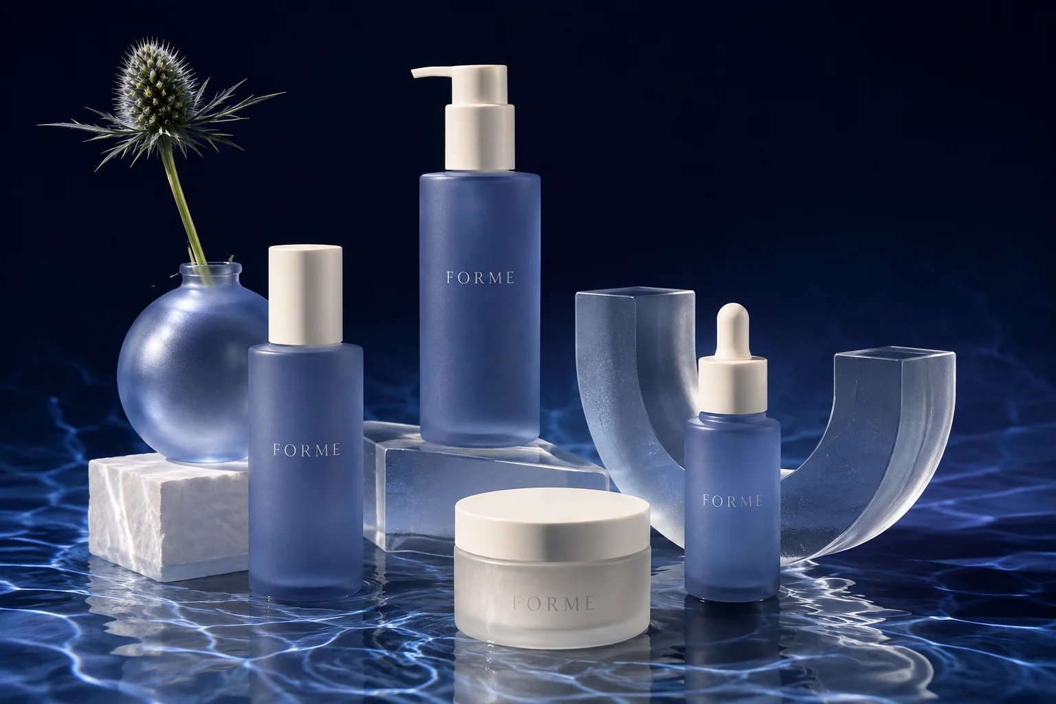
The idea
A visual identity concept for an imagined skincare line with a quieter, more sculptural presence.
Explored in this concept
- Wordmark direction
- Color and type study
- Generated packaging visualization
- Campaign image direction
Self-initiated / Fictional brand / AI-generated visuals
02 / The direction
Widely spaced serif typography gives the name room to breathe. Cobalt, porcelain, frosted glass, and reflected light create a focused material language for the brand.
Identity / Wordmark direction
FORME
A quieter kind of presence.A focused material palette
Midnight#12213F
Cobalt mist#98ADD1
Porcelain#F0ECE1
Serif typography. Generous spacing. Color used with intent.
What this demonstrates
A visual direction with palette, typography, and an AI-generated packaging scene. It demonstrates a concept, not a manufactured product or commissioned photography.
Explore a similar directionNext concept
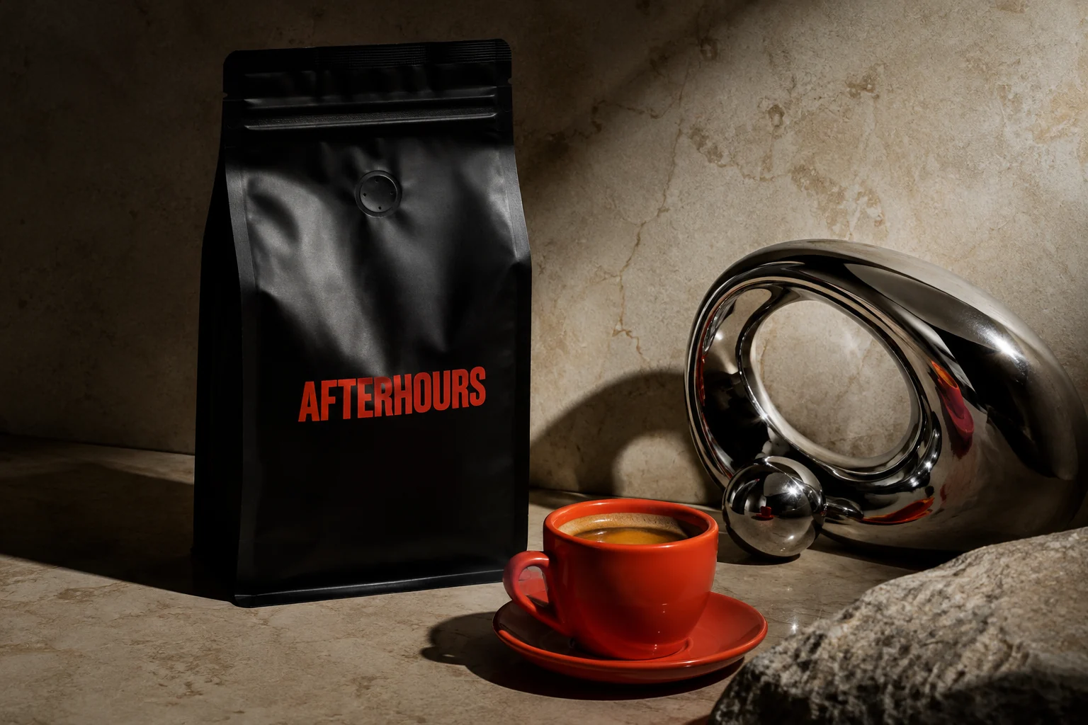
AFTERHOURS